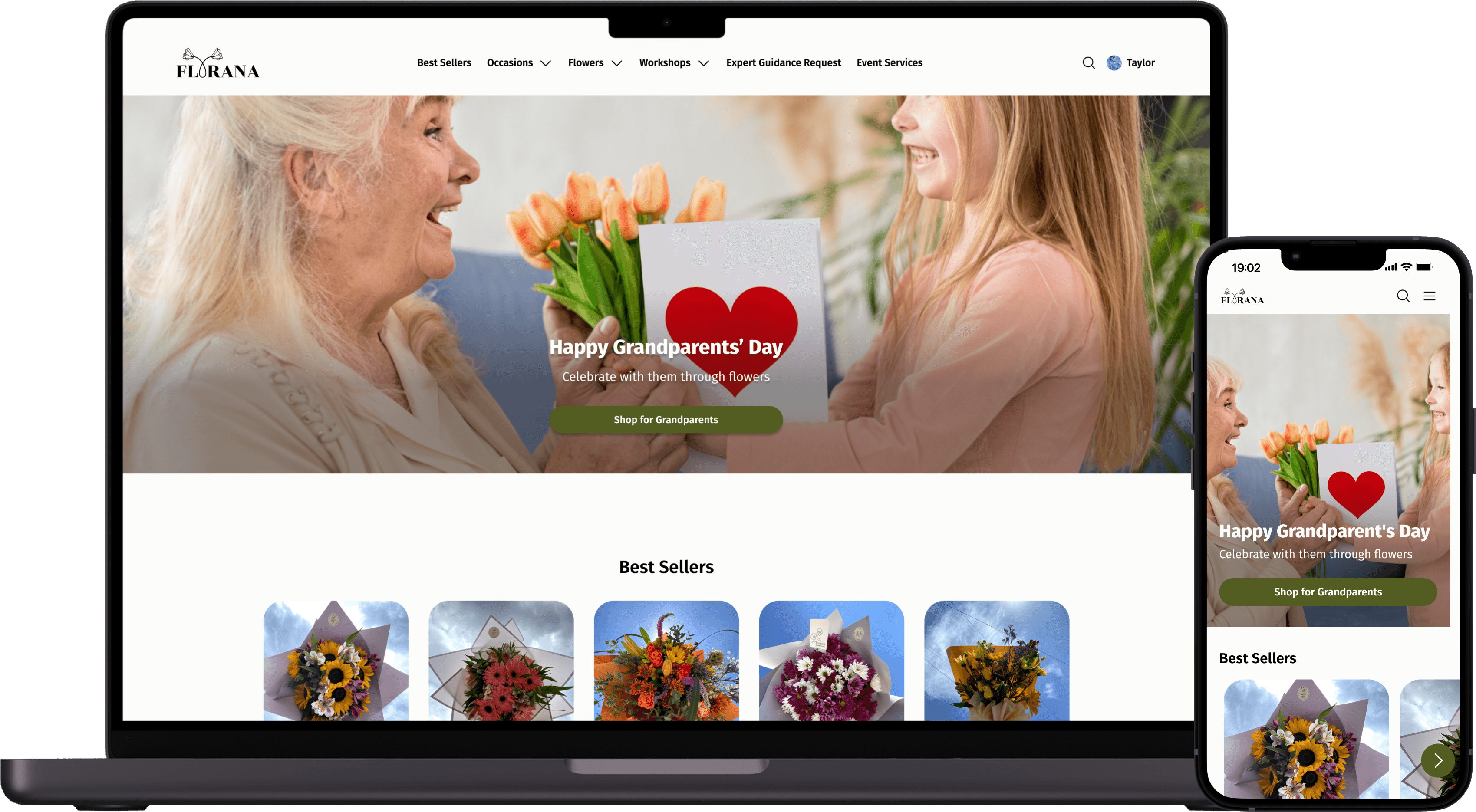
Florana's catalog lived inside Instagram. Buried, unsearchable, easy to scroll past.
Florana is a Monterrey floral studio that sold everything through social media: no catalog, no search, workshops vanishing inside 24-hour stories. I designed a responsive site to give the arrangements, custom orders, and workshops a home people could actually browse.
Responsive Web
0→1
E-Commerce
UX/UI
ROLE
UX/UI Designer · solo
TIMELINE
Q3 2023
TEAM
Self-initiated (bootcamp)
TOOLS
Figma · Lyssna · Airgram · Google Surveys
THE INSIGHT
Instagram was the storefront and the bottleneck.
I surveyed 28 of Florana's customers and interviewed 5 more online in Monterrey, aged 25 to 65. They loved the flowers. They couldn't stand finding them.
What I don’t like about Instagram is that everything goes down, and when I want to search for something, it takes me a long time to find it.
— INTERVIEW · FLORANA CUSTOMER, MONTERREY
01
Nothing stayed findable
The catalog lived in a feed, so it scrolled out of reach the moment it was posted. A quarter of those surveyed asked, unprompted, for a catalog they could browse by category.
02
Buyers wanted guidance, not just product
People aren't buying stems, they're sending a feeling, often for someone else. Most didn't know flowers well and wanted options offered to them, not a blank order box.
03
Workshops were invisible
Florana's workshops only ever surfaced in disappearing stories. Miss the 24-hour window or the photo that didn't quite catch your eye and you never knew they existed.
DESIGN QUESTION
How might we create a seamless and delightful floral experience that caters to diverse needs, simplifies purchasing, and empowers customization?
THREE NEEDS, THREE FEATURES
I built for what the research asked for, nothing more.
A long wishlist got split into must-haves and nice-to-haves. I designed the three flows the business and its customers leaned on hardest each one answering a need people had named out loud.
01
GUIDANCE
Expert guidance customization
A form where a customer describes the occasion, budget, and feeling they're after, then hands it to Florana's florist for a tailored proposal. Built for the buyer who doesn't know flowers but knows the moment.
02
VISIBILITY
Workshop inquiry and scheduling
Workshops get a permanent, dated details, photos, and an inquiry form where customers propose times that suit them. No more catching a story before it vanishes.
03
CONFIDENCE
Browse and order floral arrangements
A searchable, categorised catalog with full descriptions, pricing, and the symbolism behind each arrangement so buyers decide quickly and trust what they're choosing.
TESTING
Six users, one loud signal.
I ran an unmoderated usability test on Lyssna with six participants across all three flows. Satisfaction landed between 4.2 and 4.5 out of 5, solid, but the open comments kept circling the same piece of friction.
01
Everything hid behind the menu.
Each task started from the hamburger menu, and participants kept asking for the core actions to live on the home screen instead. For the next iteration I promoted guidance, workshops, and arrangements to the homepage. So, no one has to dig through a menu just to begin.
Before
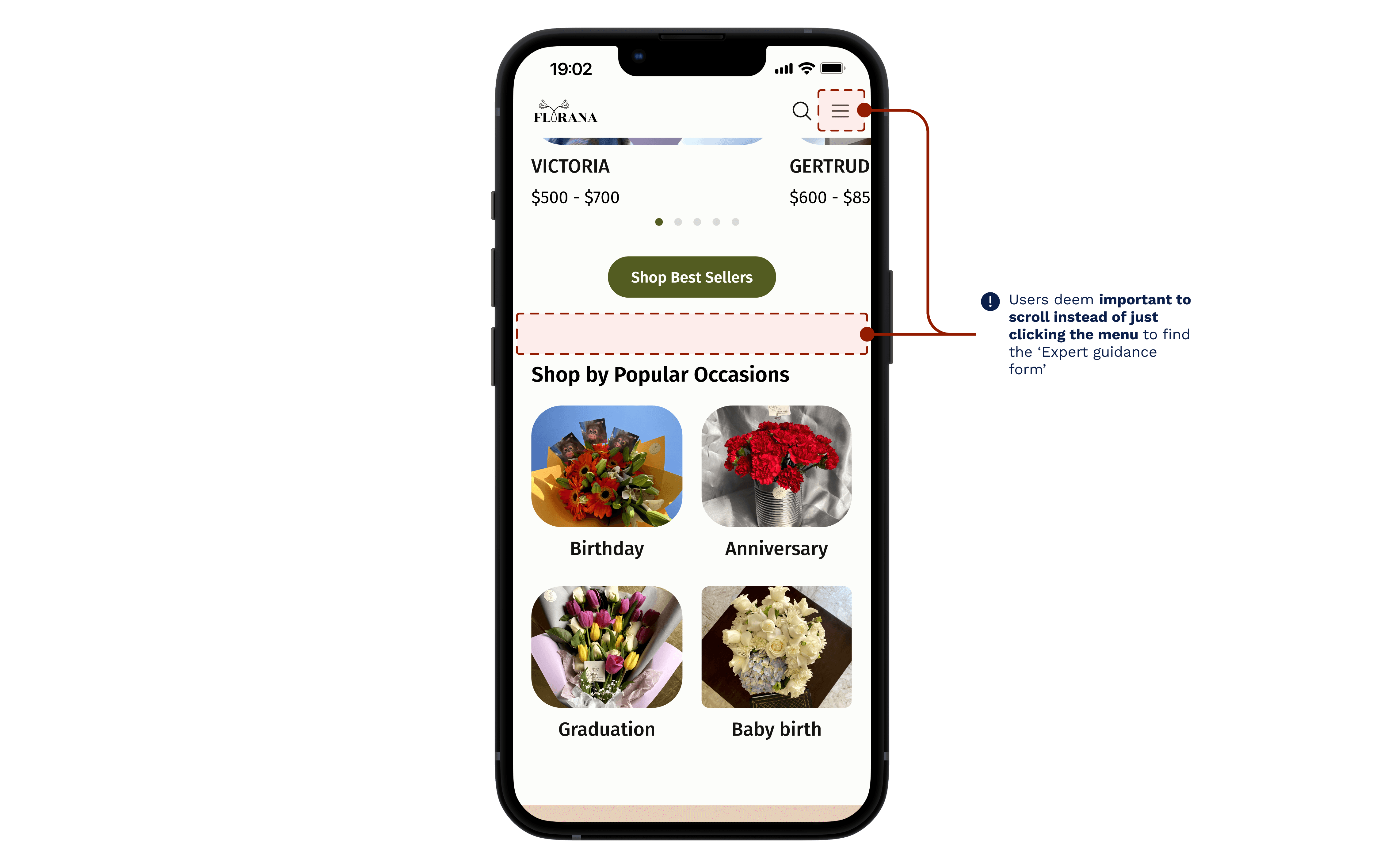
No expert guidance form to fill on home · hidden in menu
After
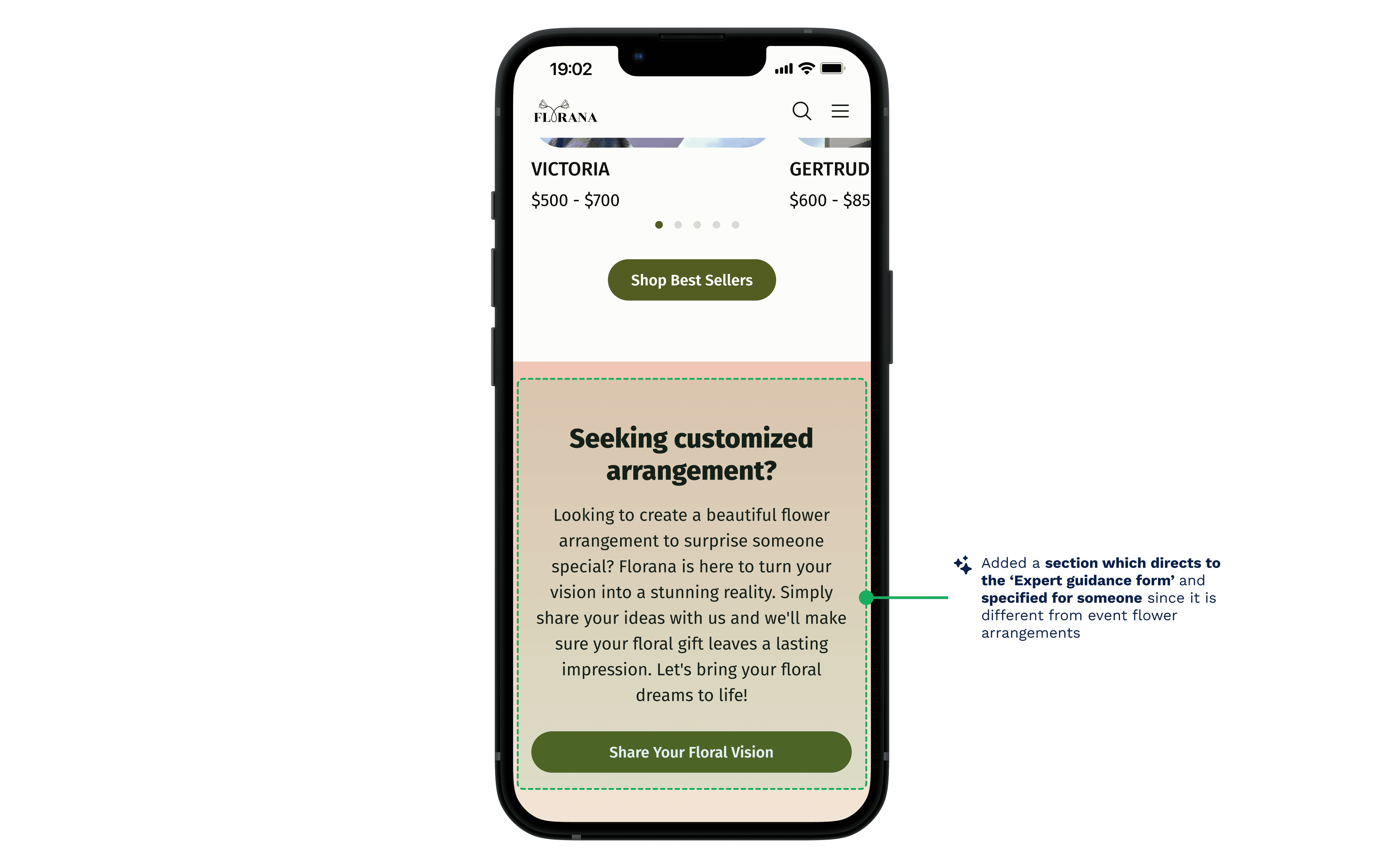
Section for expert guidance form · easy to locate
Before
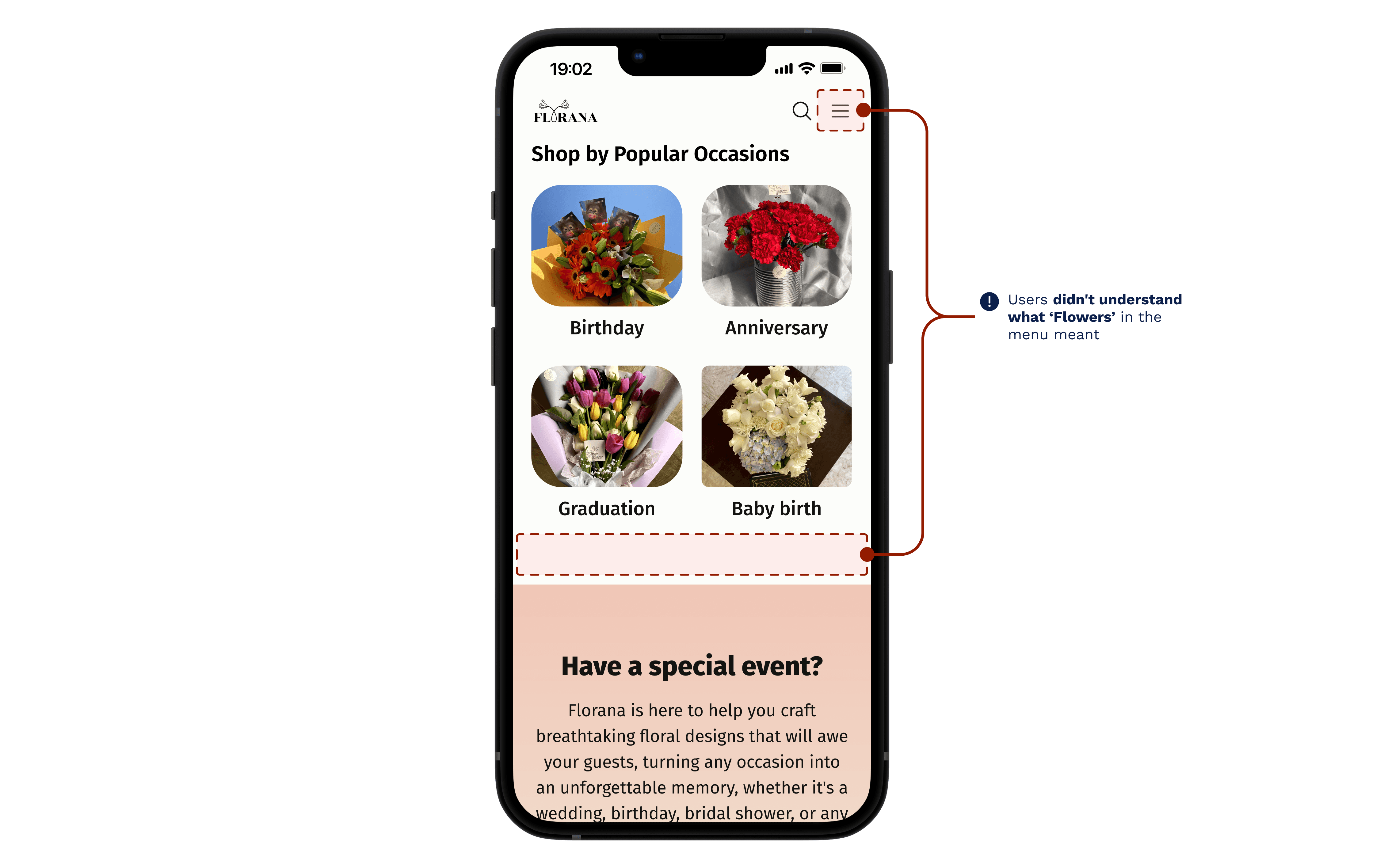
No understanding of Flowers in menu
After
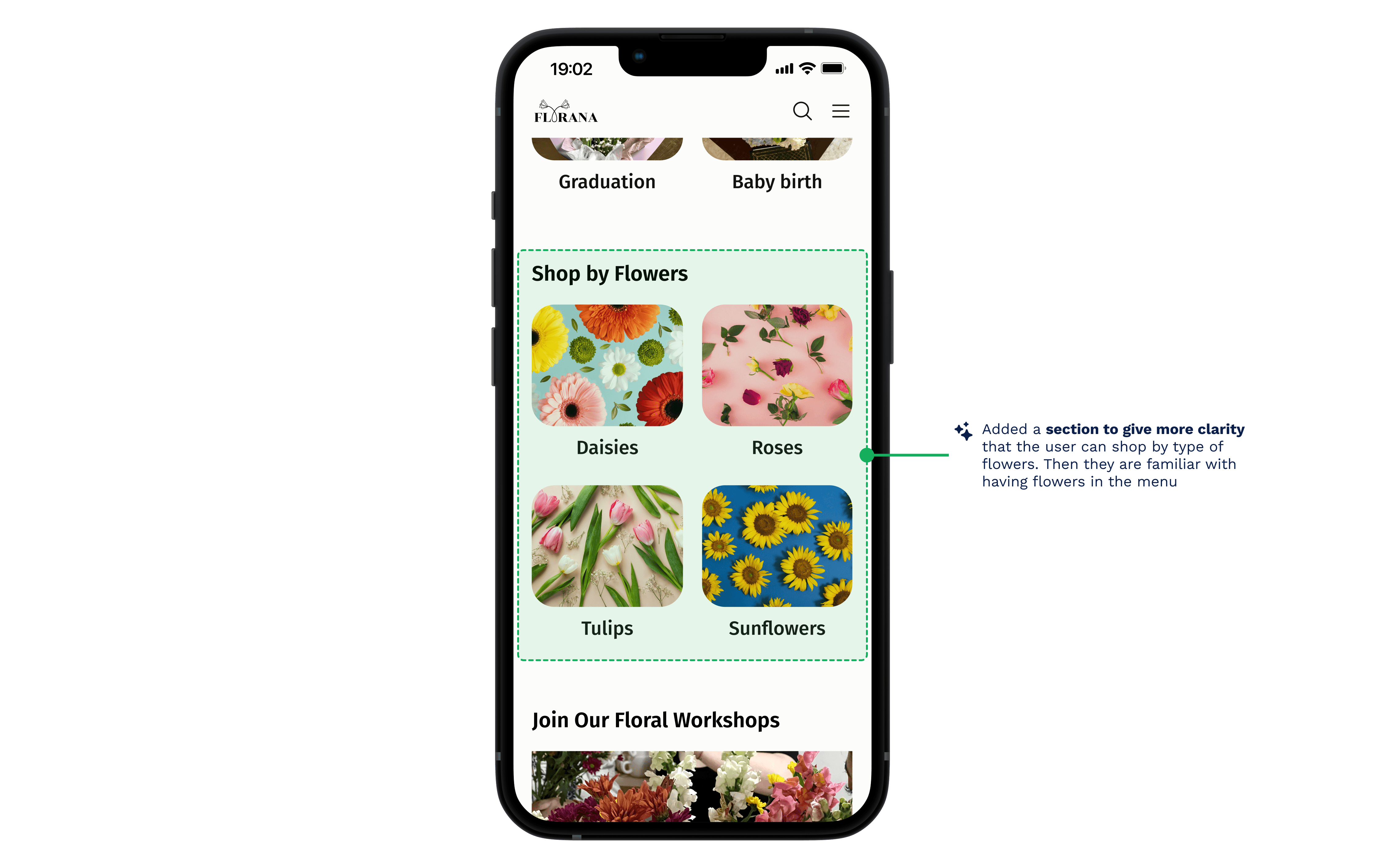
Section for flowers · different flower options displayed
Before
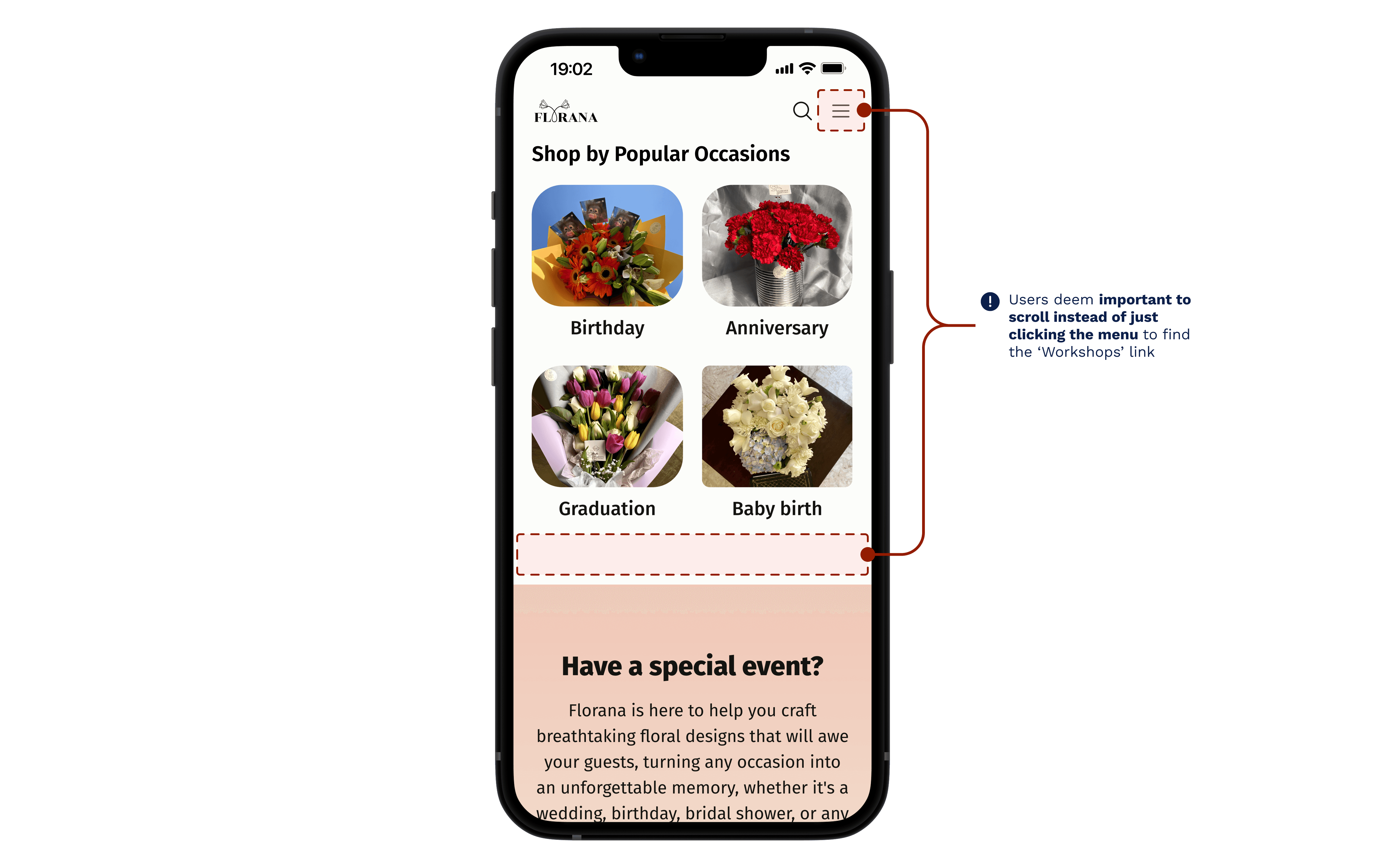
No workshop direct link in home · hidden in menu
After
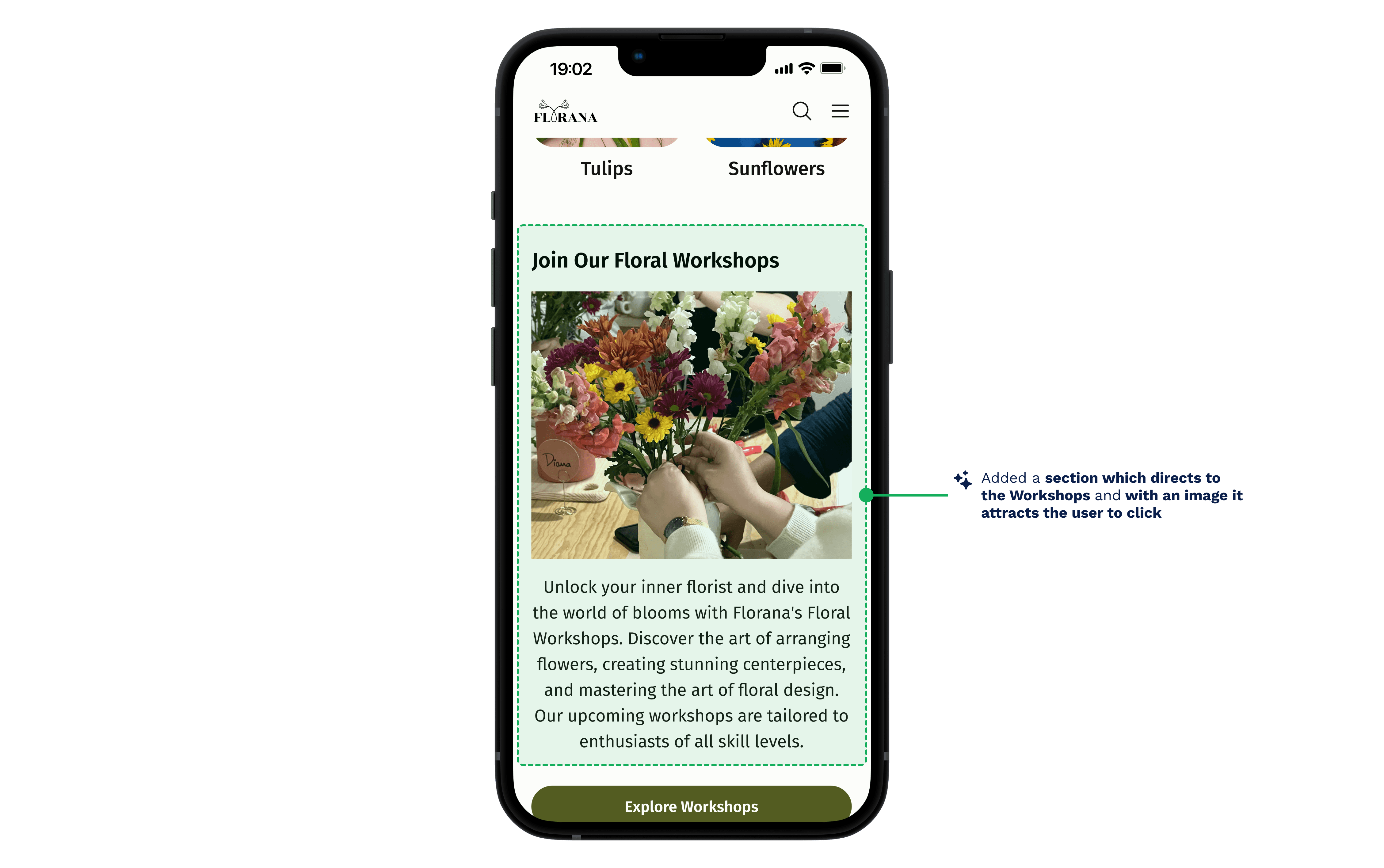
Section for workshop · image display for engagement
02
No idea which day of the week it is delivered.
Locating the Expert Guidance form took 117 seconds on average against a 300-second target; completing it took 81 against 600. The structure worked, the real problem was people not knowing which day their flower arrangement will be delivered.
Before
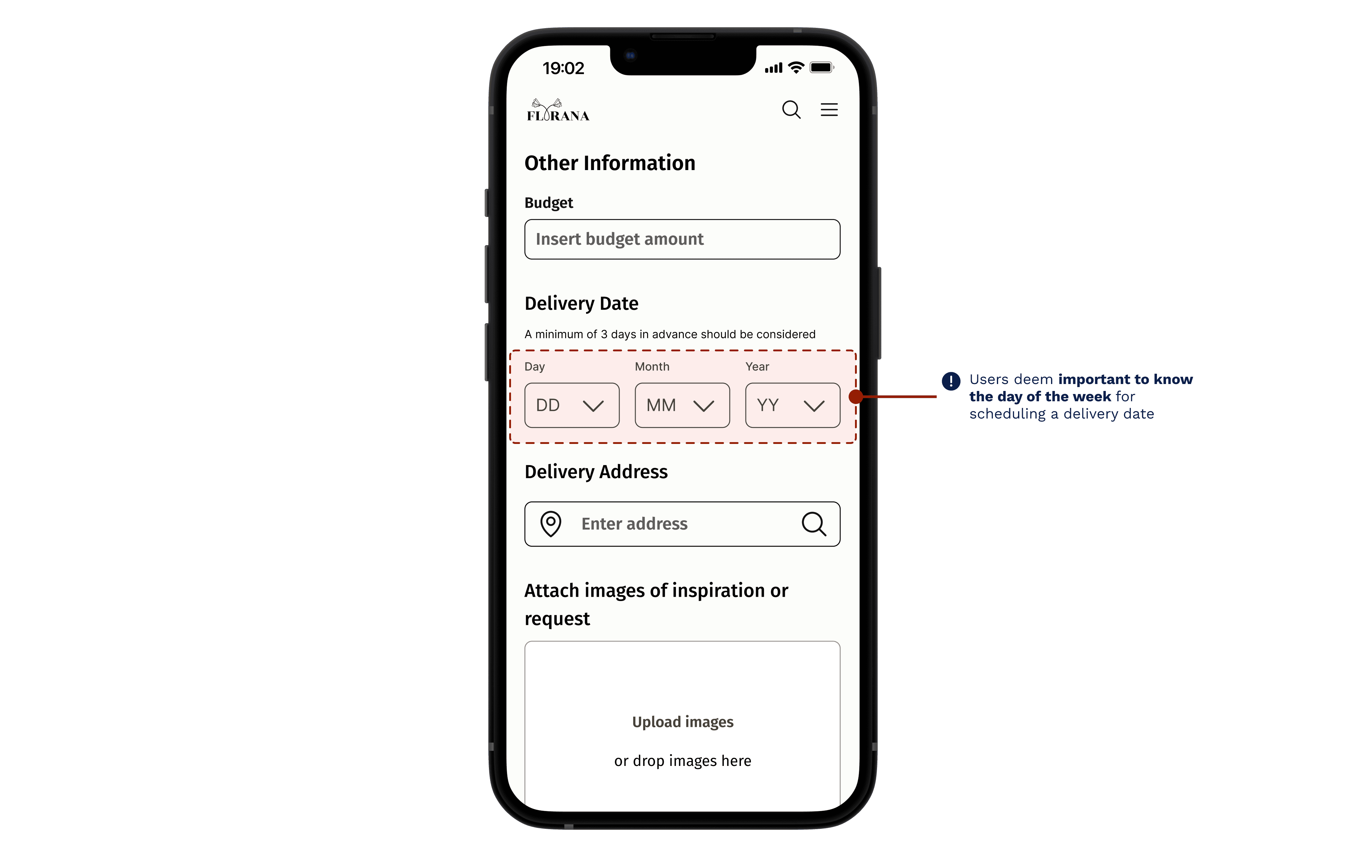
No day of the week displayed · no clarity
After

Date picker · certainty for order delivery date
VISUAL IDENTITY
From a borrowed rose to an eucalyptus mark.
Florana's old logo was assembled from stock Canva assets. We rebuilt the identity around: fresh, calm, and delicate. A muted sage palette and Fira Sans carried that essence across the catalog, the forms, and a full UI component library.
freshness
+
delicate beauty
=
Flor
ana
Olive
#535C21
Blush
#EBA394
Sage
#DFE5BC
Logo
Florana
OUTCOME
6
Participants tested
Lyssna, all three flows
4.3
Avg satisfaction / 5
clarity & expectations
81s
To complete the form
against a 600s target
LEARNINGS
What I'm taking with me.
01
Designing across a border and a language.
The client was in Monterrey, I was in Germany. Interviews ran in Spanish (transcribed with Airgram) and schedules straddled time zones. We agreed on English as the working language. Adapting communication wasn't overhead, it was the job.
02
A tight timeline forces real prioritisation.
A full responsive design build with limited time meant ranking every feature must-have against nice-to-have, and breaking the work into stages I could actually finish.
03
Feedback is a loop, not a phase.
Pulling users in early and often let me course-correct before polish instead of defending decisions after they'd already hardened.
WHERE IT WENT
The honest ending.
→
Promote the three core actions to the home screen, the one change every tester pointed at.
→
Replace the scattered Instagram-and-Facebook workflow with a single place the owner controls.
→
Then the brief pivoted: near the end, the owner chose to focus Florana on event-only floral work… a different site, a new project. So this one stops, honestly, at a validated prototype rather than a launch.
Let's make something
together.
© 2026 Claudia De León
v4.0 · Made in Framer with a small dance break