Every immigration app hands you a checklist. None tell you how or who to trust.
Turtlfly turns the isolating, interdependent mess of moving countries into a guided process. A personalised checklist, mentors who've walked the path, and the feeling of an actual next step.
MOBILE APP
0→1
UX/UI
ANDROID
[ Turtlfly · today's checklist ]
ROLE
UX/UI Designer · solo
TIMELINE
Q1 2024
TEAM
Self-initiated (bootcamp)
THE INSIGHT
A checklist isn't the hard part.
I surveyed 11 people and interviewed 6. Four who'd already immigrated, two planning to. The same three gaps surfaced every time.
It's like no one will tell you the how. They'll tell you what you need or what you shouldn't do, but they won't tell you how to do it. And as an immigrant, it's hard to figure that out.
— INTERVIEW · IMMIGRATED 2022
01
Information overload
Unclear, interdependent requirements mean people never know if they actually have everything they need.
02
Checklists aren't enough
People don't just want a list of what. They want the how, and to see where they are in the process.
03
They don't know what to trust
Official sources fall short, so people lean on word-of-mouth and those who've walked the path before.
DESIGN QUESTION
How might we turn the complex, isolating journey of immigration into a guided, collaborative, and empowering one?
THREE PRINCIPLES, THREE FEATURES
One insight, one decision. Nothing extra.
I let each validated insight drive exactly one decision. No feature without a reason behind it.
01
CLARITY
A personalised, team-verified checklist
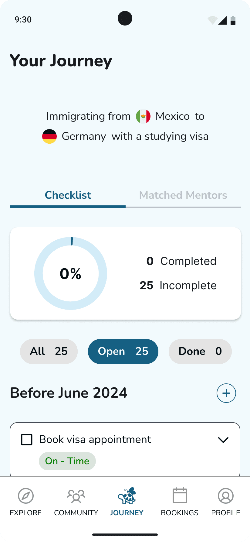
A short onboarding questionnaire (origin, destination, reason) generates a one-screen checklist tailored to the user. Each item expands to answer the how, not just "book a visa appointment," but where, and how long it takes. Progress, filters, and on-time tags give a constant sense of control.
02
TRUST
Mentor profiles built on social proof
Users book video calls with vetted mentors who've made the same move. Profiles lead with the trust signals testing told me mattered most: ratings, reviews, sessions completed, and topics covered.
03
EMPOWERMENT
A session loop that closes itself
After each call, users rate the mentor which feeds the social proof the next user relies on. The product gets more trustworthy as more people use it.
TESTING
Three tests changed the design in three concrete ways.
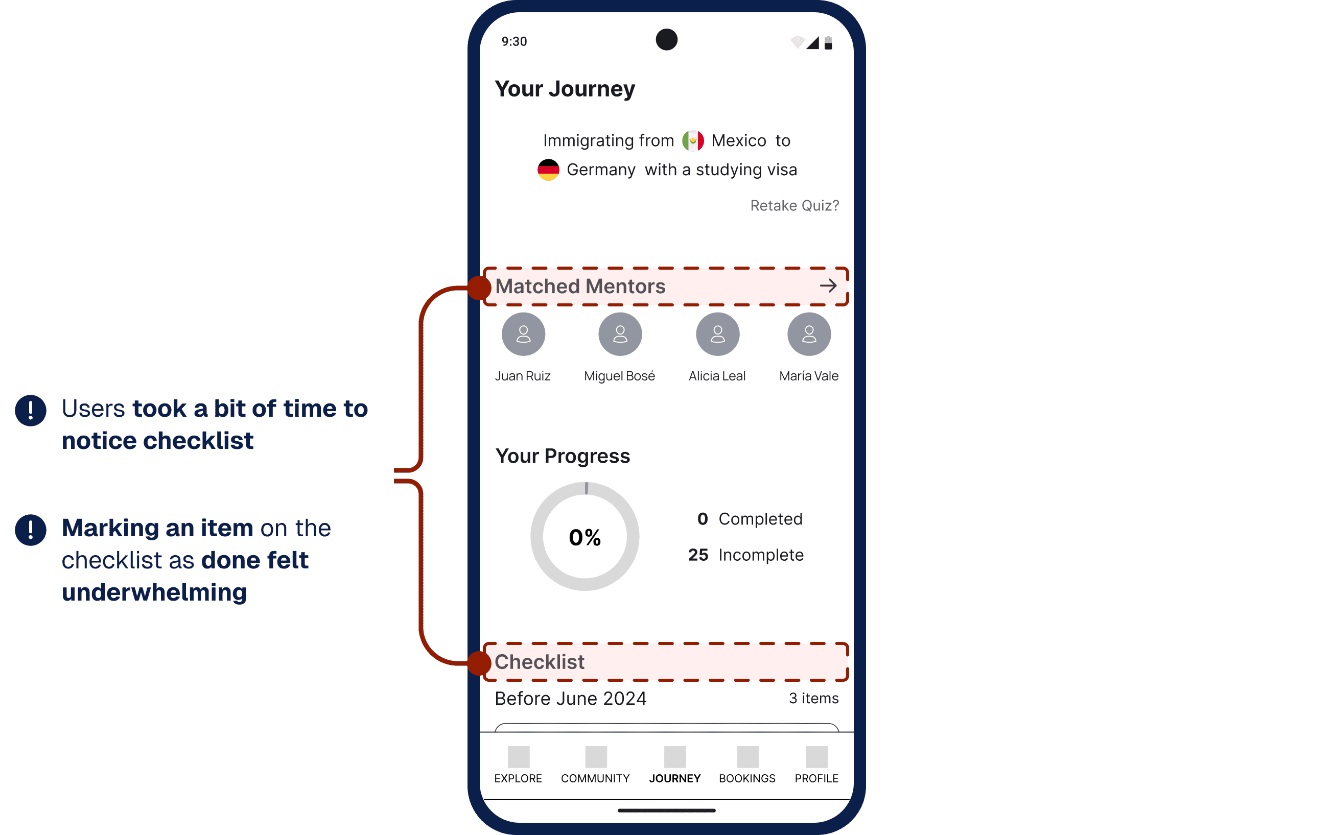
I ran moderated tests with 5 participants on a mid-fi prototype before investing in high fidelity. Every participant completed every flow, but the scores told a sharper story than the completion rate alone. The checklist flow scored lowest on ease and satisfaction and there were closing comments on the mentor booking flow. That's not a footnote; it's the signal that pointed me straight at my redesigns.
01
Completing a task felt like nothing.
"The way it is now, I feel like I didn't do anything."
I added a confirmation toast, a clearer progress ring, and quick-filter chips (All / Open / Done) so finishing a task actually feels like progress.
Before
Plain list · no completion feedback · no filters.
After
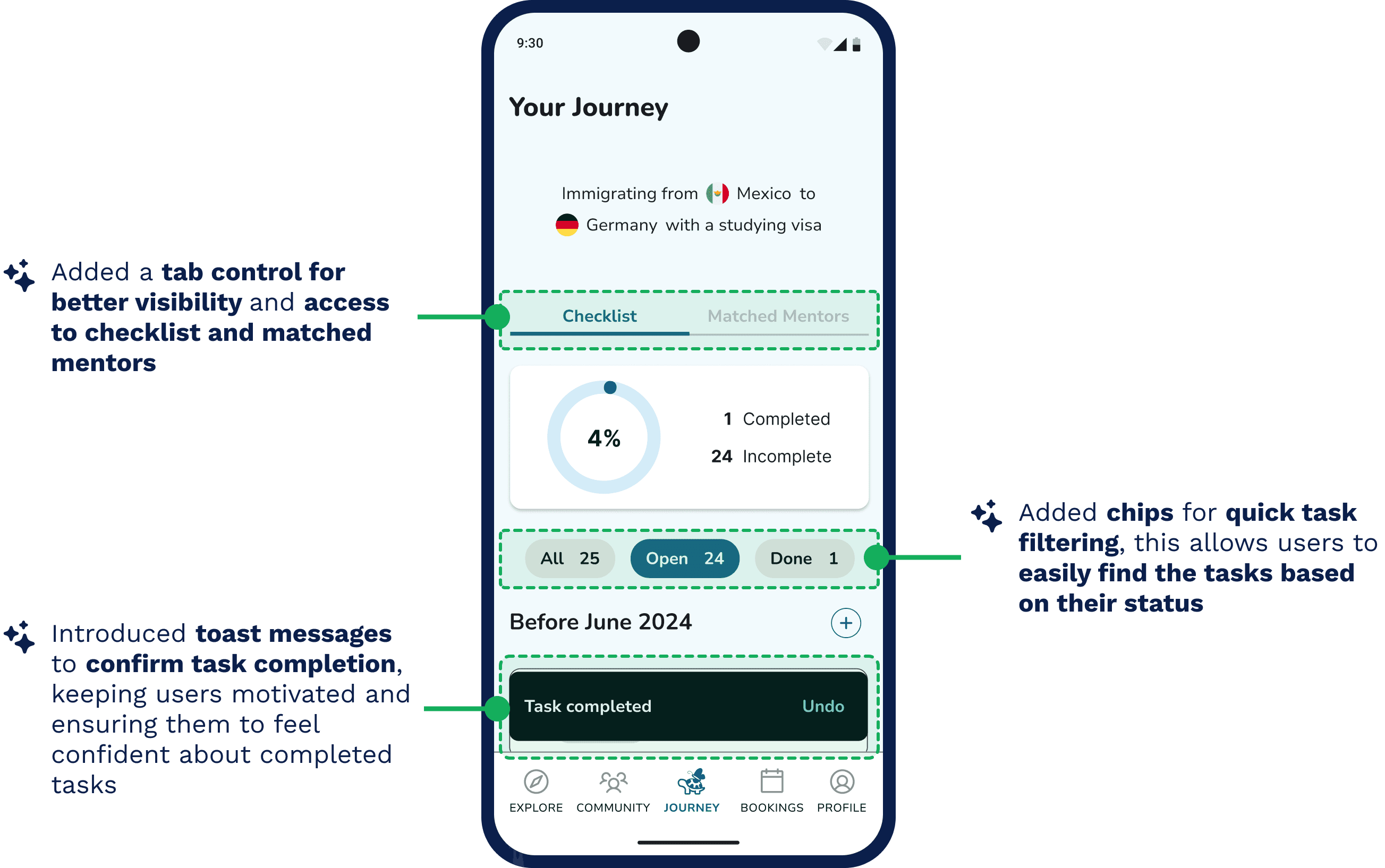
Progress ring · toast on tap · All / Open / Done filters.
02
Users couldn't choose a mentor from a name alone.
"I'd like to see who has rated or had comments about the mentor before I booked."
I replaced the bare mentor list with rich cards: ratings, reviews, sessions, attendance, topics plus filter and sort.
Before
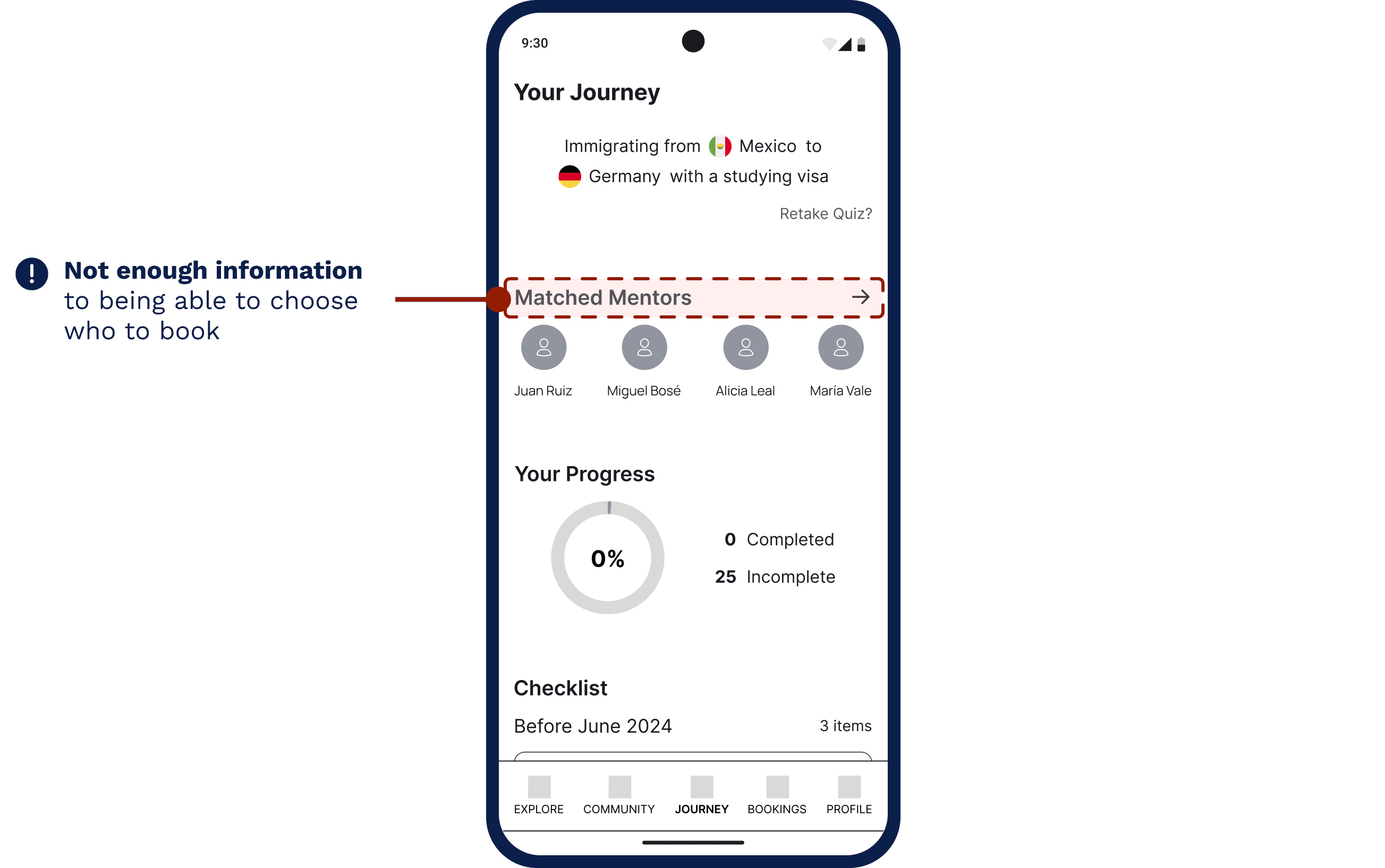
Plain mentor list · no mentor details · no user metrics · no filters.
After
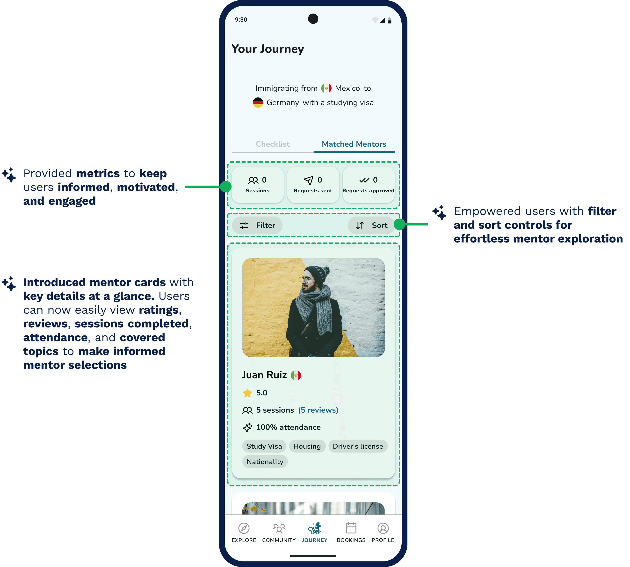
Mentor cards · information at a glance · filter and sort controls.
03
Mentors stats were buried and unclear.
Users took time to find the statistics and for the selected date they weren't sure what it meant. I surfaced reviews at the top of the profile and added a "read more" for the mentor's story.
Before
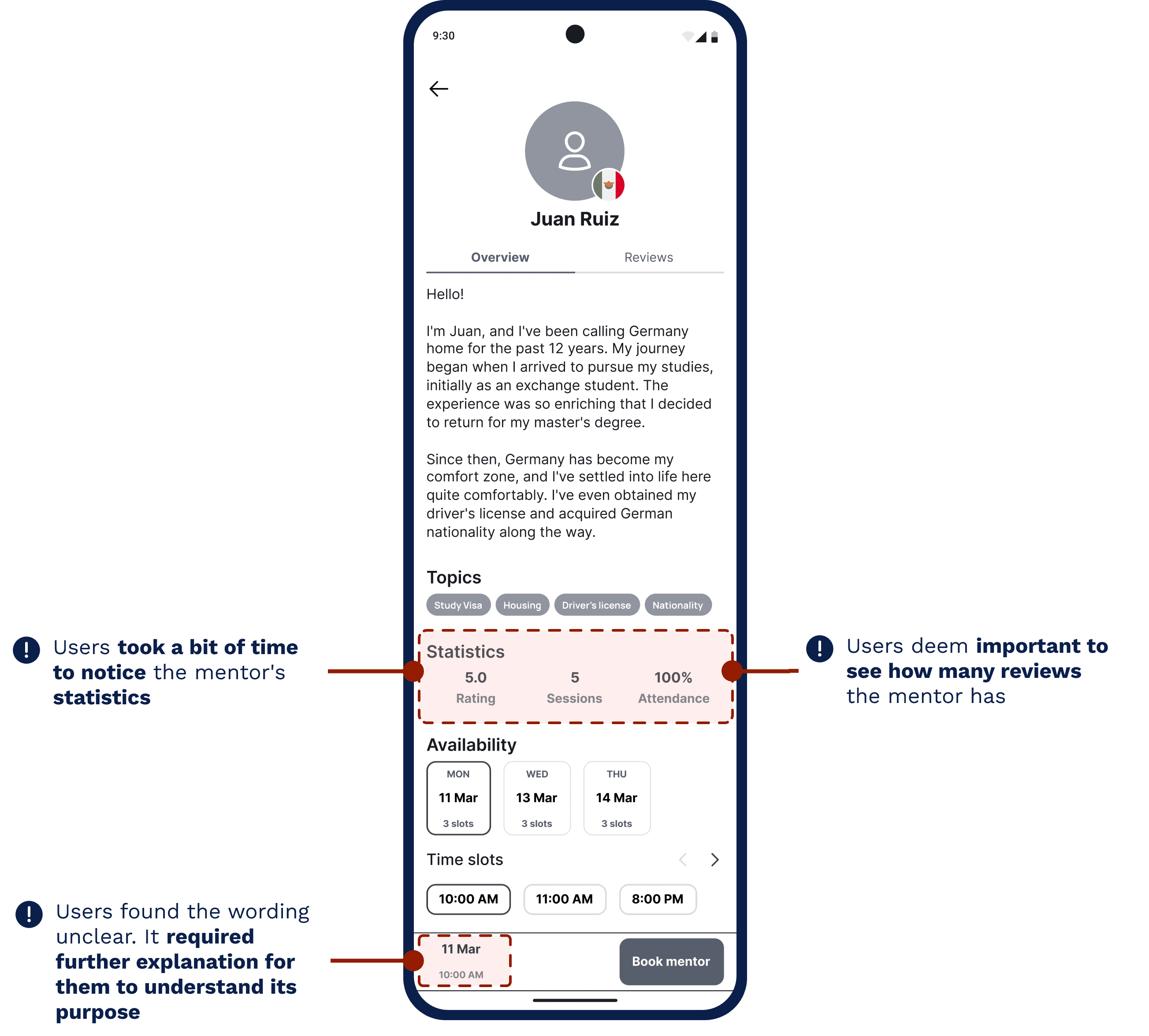
Lost statistics · no mentor reviews · no understanding of short date.
After
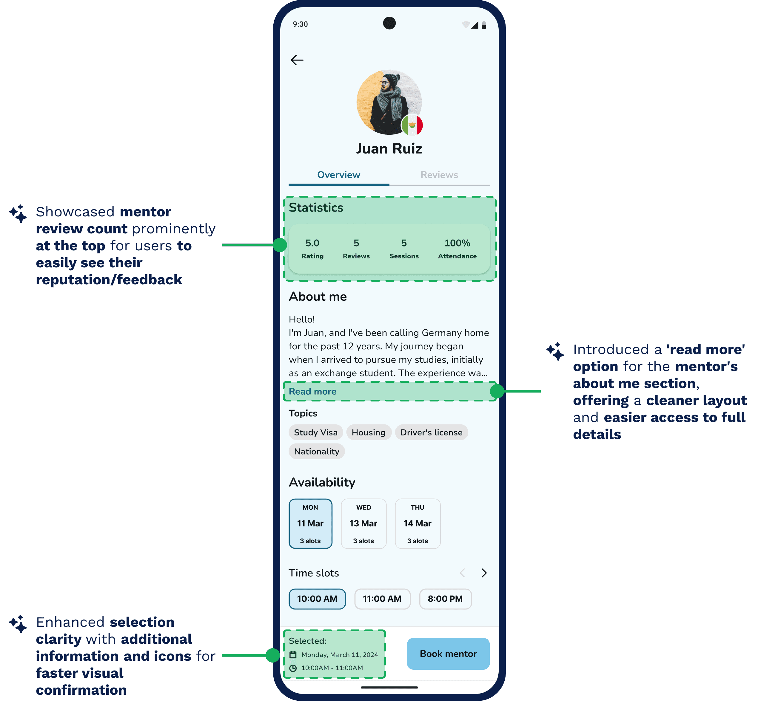
Statistics on top · cleaner layout · selected date clarity.
VISUAL IDENTITY
A turtle that flies.
The name blends turtle (the journey, navigating alone yet setting your own path) and butterfly (transformation, new beginnings). Calm blues signal communication and trust. So users feel guided, never pressured.
turtle
· the journey
+
butterfly
· transformation
=
turtl
fly
Light blue
#D3ECF8
Seagull
#7CC6E9
Teal
#166083
Logo
Turtlfly
OUTCOME
Task completion
5/5 participants, 4 core flows
Ease of use (avg / 5)
moderated test, n=5
Would help their move
post-test agreement
LEARNINGS
What I'm taking with me.
01
Focus beats features.
My instinct was to add; the discipline was to cut back to what each validated insight actually demanded. Three problems, three principles, three features.
02
Iteration is the real skill.
My first designs weren't right and that was the point. The friction testers hit became the best parts of the final product.
03
User needs and business goals can diverge.
I'd assumed mentorship should be free to match the mission, but testers expressed willingness to pay. A real tension I'd want to research before resolving.
WHAT'S NEXT
Where I'd take it from here.
→
Re-test the hi-fi prototype to catch finer UX issues.
→
Validate whether and how users would pay for mentor sessions.
→
Design the Explore and Community flows hinted at in the navigation.
Let's make something
together.
© 2026 Claudia De León
v4.0 · Made in Framer with a small dance break